
Help Me Decide My New Preaching Book’s Cover
I need your help.
I’ve been working hard for the last four months, and I’m in the final stages of editing my new book called, Preach and Deliver: Captivate Your Audience, Kill Bad Habits, and Master the Art of Sermon Delivery.
It’s a natural follow-up to my book, Preaching Nuts & Bolts: Conquer Sermon Prep, Save Time, and Write Better Messages.
The first book was about preparing the sermon. This book is about sermon delivery.
I know the stuff inside the book is going to be great, but unfortunately, people do judge a book by its cover.
So here are four ideas for the new cover.
Which one is your favorite? (cast your vote in the poll below)
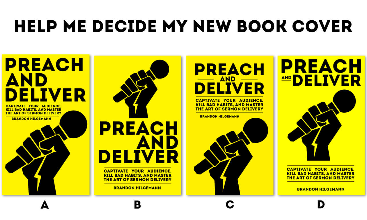
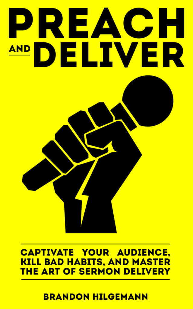
Option A
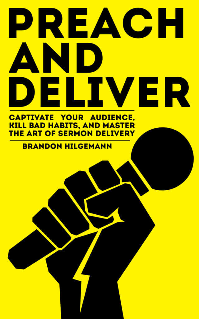
Option B
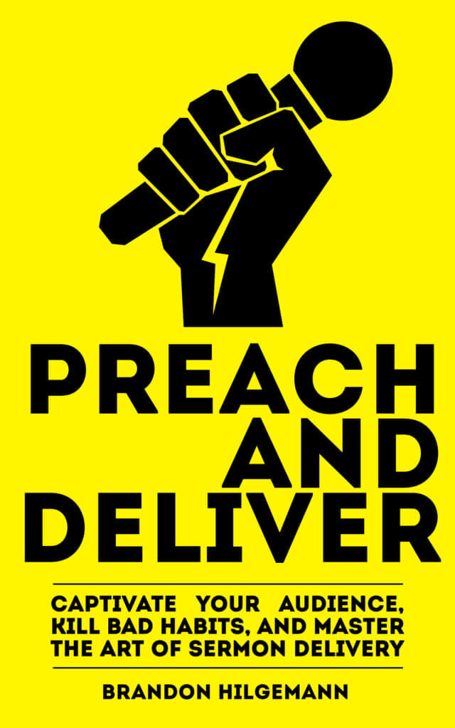
Option C
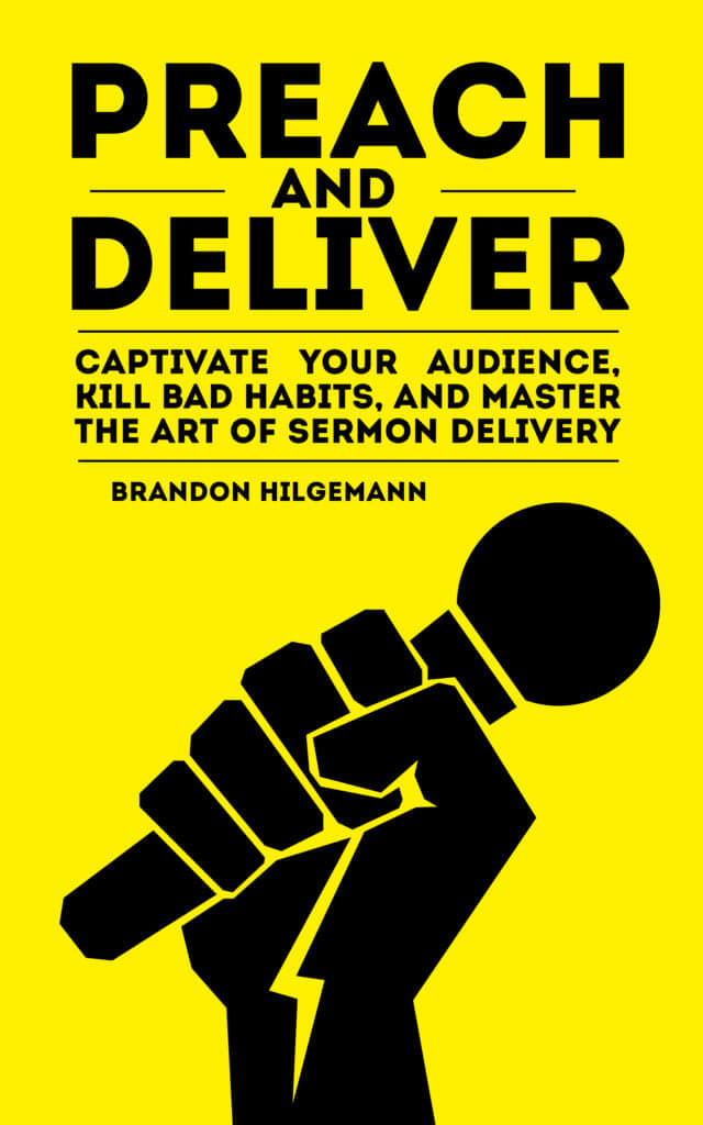
Option D
Please vote in the following poll. And, if you really want to help me out, scroll down and leave a comment in the comment section to let me know what you like or what you don’t like.
[polldaddy poll=9656844]
Thanks for the help! I truly value your feedback.
Also, if you would like a free advanced review copy of the book for your blog, please contact me.


The hand up like that speaks of revolution. It is used by communists. At first I thought it was a man with a pack on his back, and then I saw it was the revolution hand. https://www.pinterest.com/pin/502995852105539638/ for example—It is the revolution hand with a microphone. Or just google “revolution hand” to see many examples.
I like option B because it really draws you in with the graphic on the top. However I think the word “AND” is out of place. I would center it with the lines on either side like you have done in option C, but I would keep the other words “Preach” and “Deliver” bigger instead of making them small like they are in option C. Also, is option D supposed to be a brighter color yellow than the others? I think the brighter yellow is better and that may be the reason people voted for option D most.
Thank you. That’s great feedback! I will definitely look into that.